UPM has evolved into a material solutions company. Now, we are updating our brand to better reflect who we are, what we do and the impact we make.
Through these brand guidelines, we want to ensure that all stakeholders, from UPM employees to external agencies, are aligned and understand how to represent the UPM brand consistently and effectively. Please familiarize yourself with these design fundamentals and share them with your creative partner before starting any project
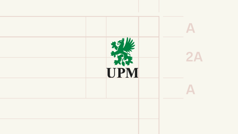
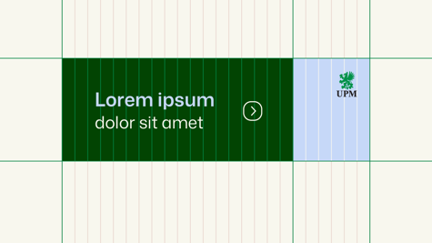
Leave space around the logo, free of other graphics, text, or imagery. This ensures the logo remains visually distinct and legible, even in a cluttered environment. The clear space allows the logo to stand out and create a strong visual impact.
UPM logoWe are embracing our heritage logo one again.
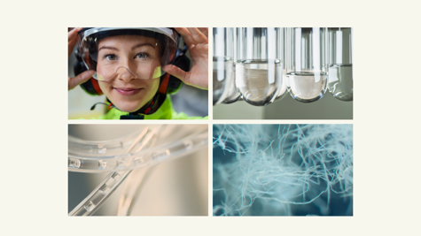
Image styleOur new image style is clean and minimal, with a strong emphasis on innovation.
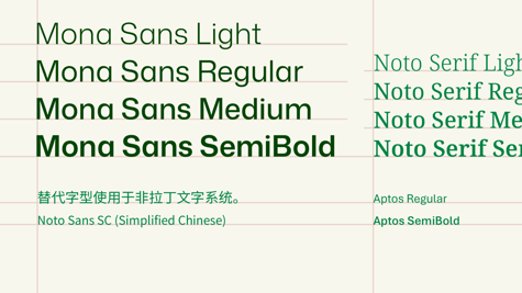
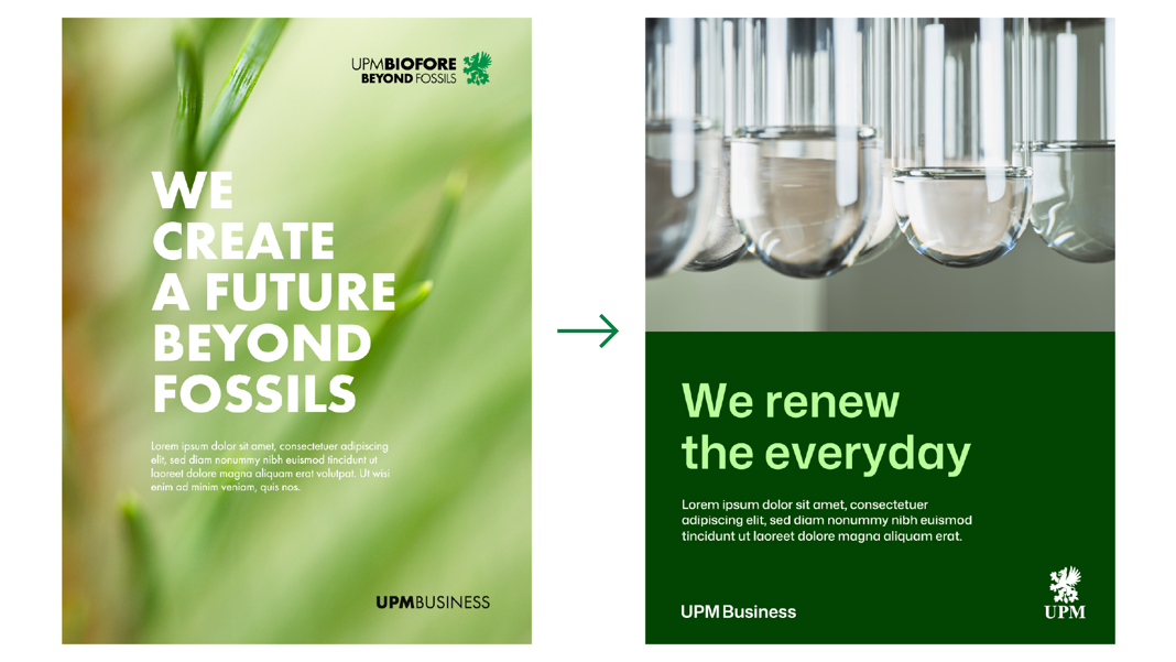
TypographyHeadline style is refreshed and modernized. Our primary fontis now Mona Sans.
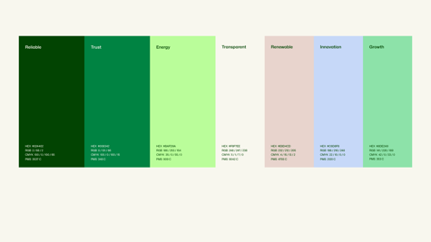
ColorsUpdated color palette has a fresh look, now featuring an extended range of greens.
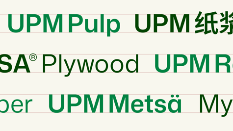
Business namesUpdated style and placement for the UPM Business names