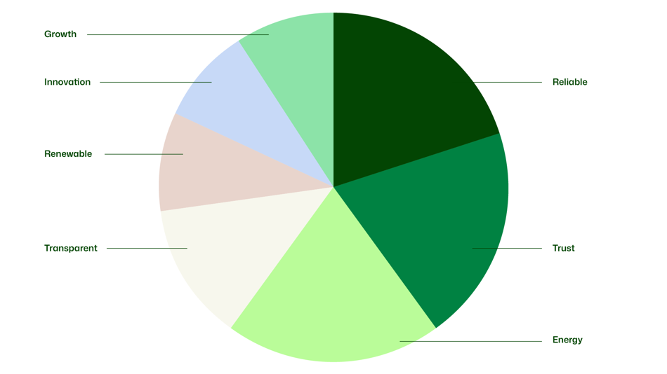
Primary colors
Colors are powerful tools for brand recognition, reinforcing the memorability of our visual expression. Our main colors are all green, symbolizing reliability, trust and energy — qualities inspired by the spirit and values of the renewed UPM brand. Each color is thoughtfully named to reflect these values, reinforcing the essence of our brand. These greens are central to our visual identity and must be used consistently to ensure strong and recognizable brand expression.
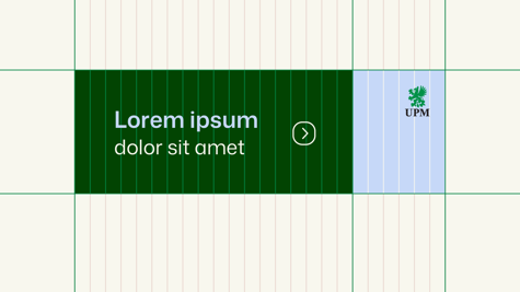
Reliable is an elegant, dark green ideal for large surface backgrounds, as well as a text color on light brand colors or clean images. Trust works perfectly as a highlight color for URL links, icons, headlines or subheadlines and large surface backgrounds. Energy is a choice for strong emphasis against on Reliable or as a full color background (with Reliable text on it).
Always make sure to follow the defined color combinations and color hierarchy described on the next pages.