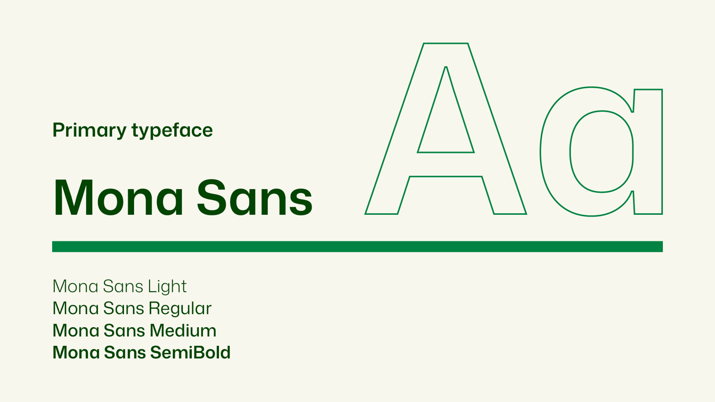
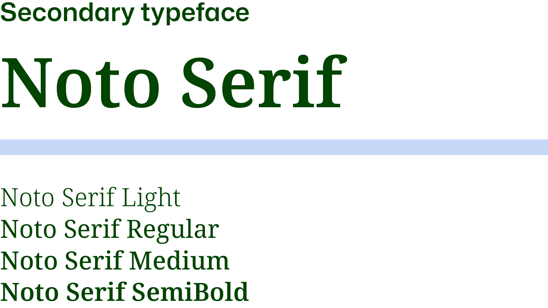
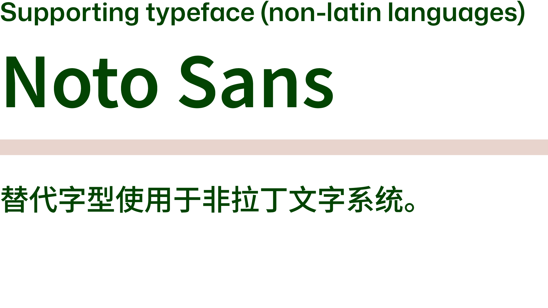
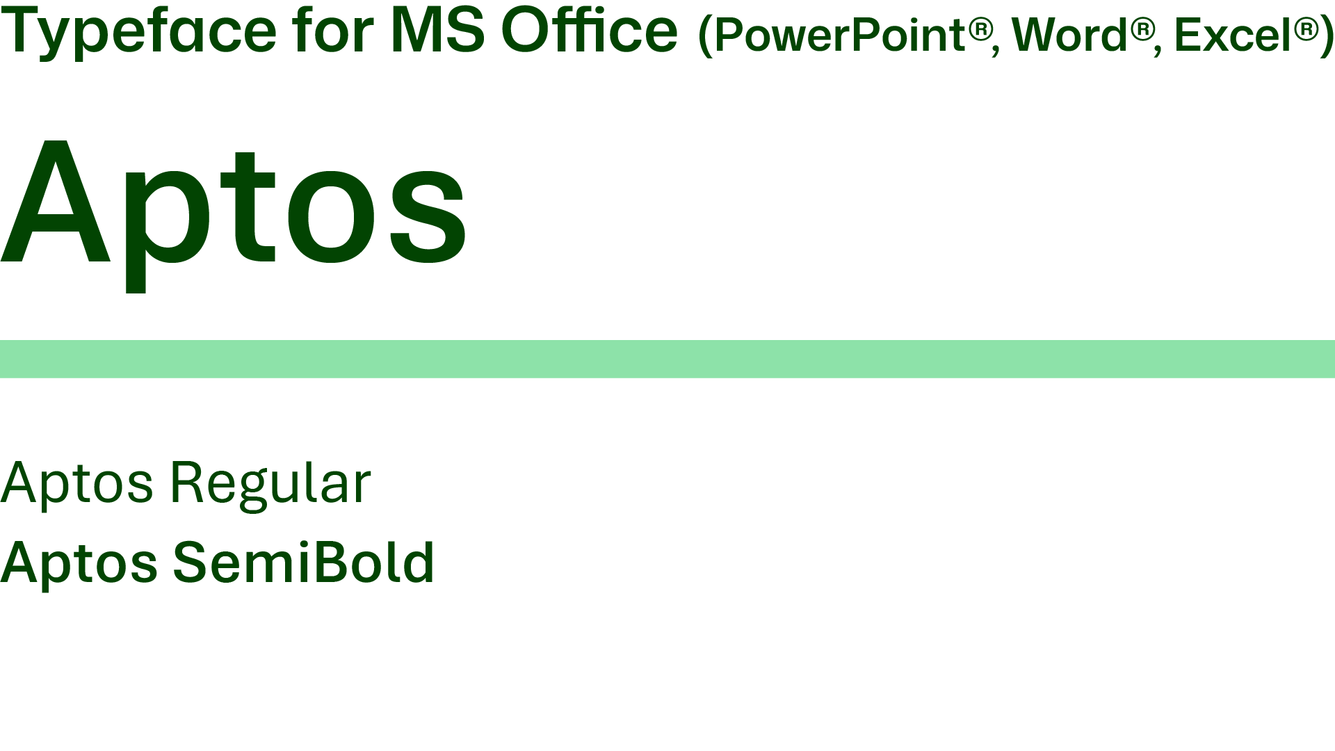
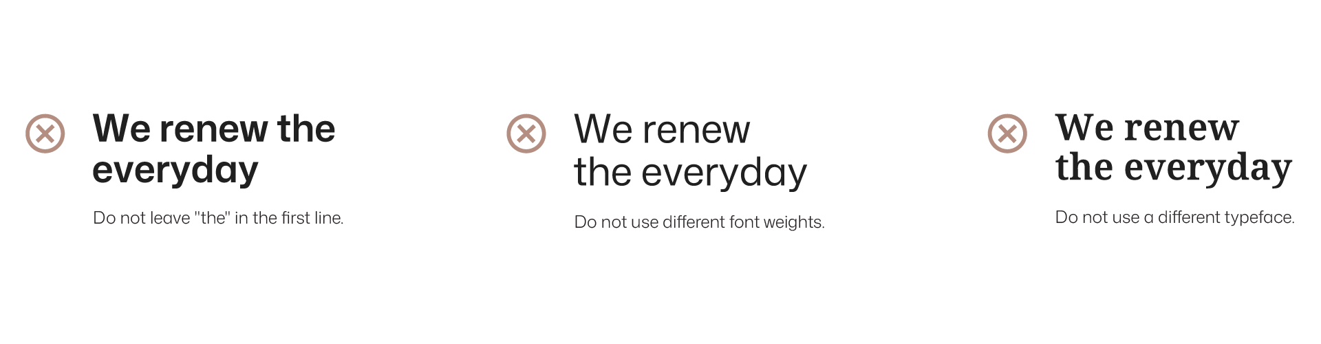
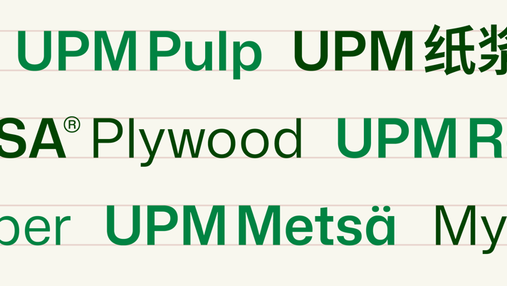
Typesetting
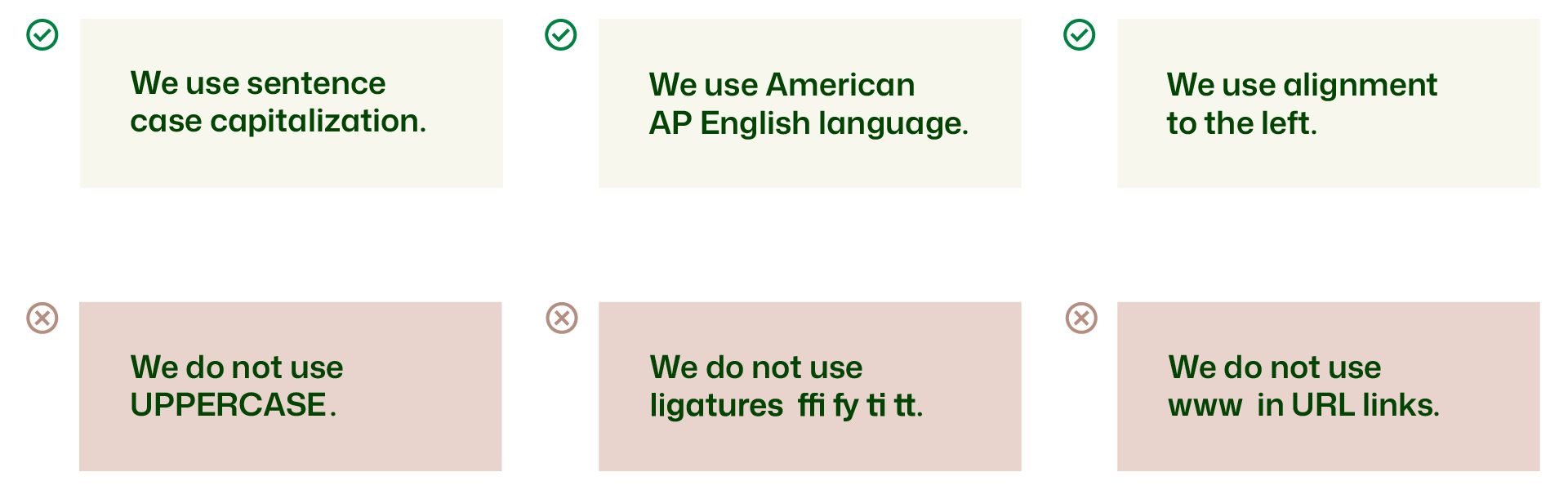
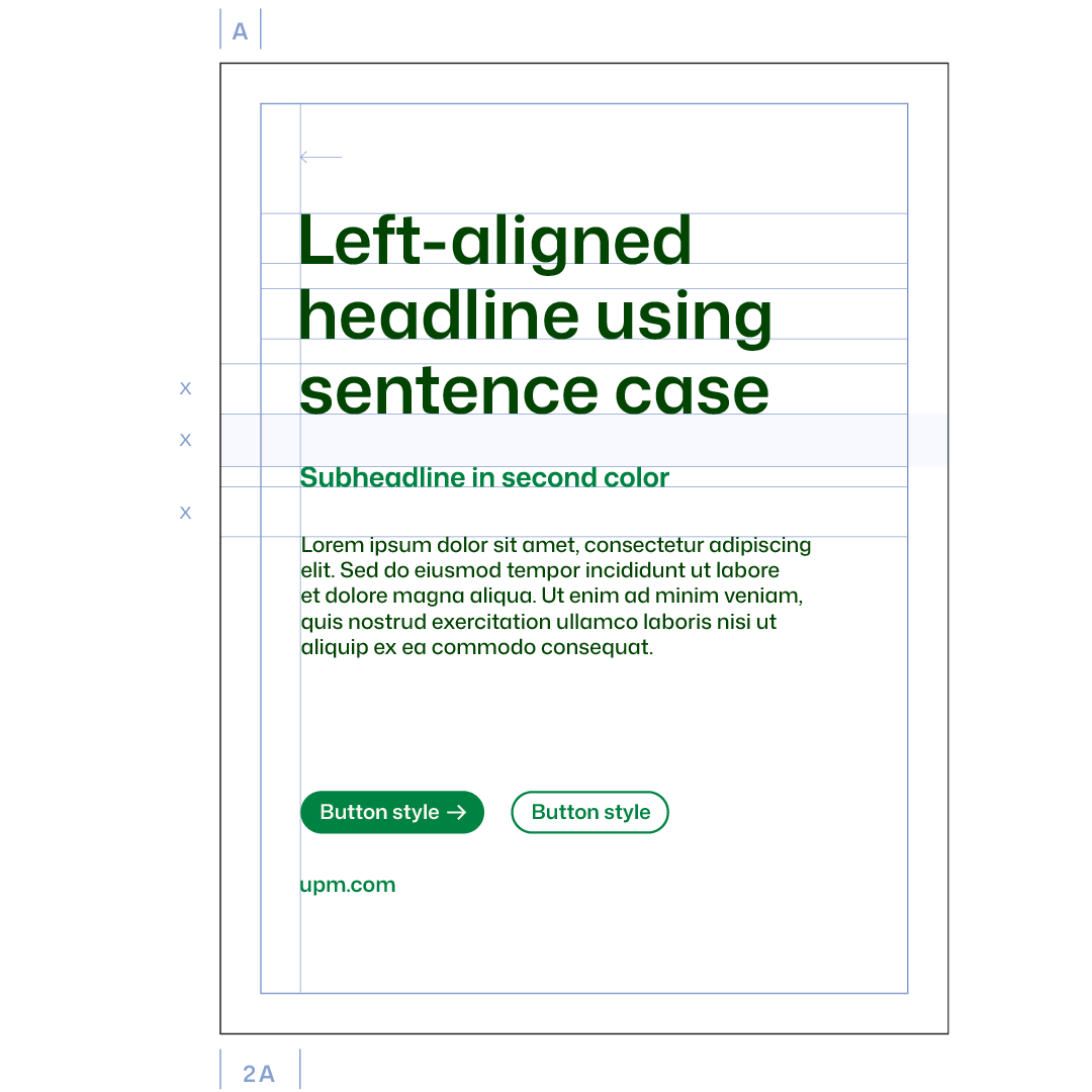
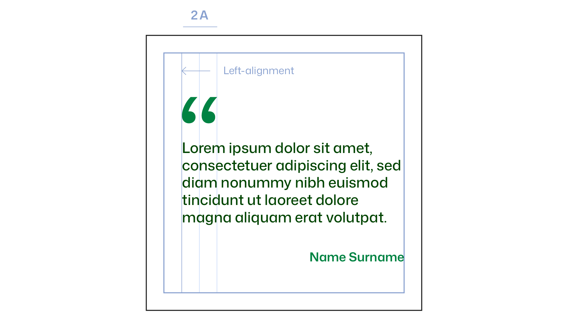
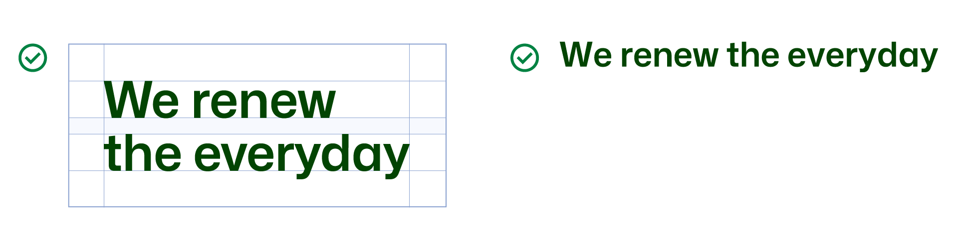
When working with typography in our brand communication, we adhere to a clear and consistent style. We use sentence case capitalization to maintain a straightforward, approachable tone and intentionally avoid uppercase letters, favoring a more natural and inviting appearance.
All content is crafted using American AP (Associated Press) English, ensuring clarity and correctness. For a clean and easy-to-read layout, we align all text to the left, promoting a structured flow of information. Ligatures are avoided to keep the text visually clean and legible. Lastly, when sharing URLs, we exclude "www" to maintain a modern, streamlined look.