Printed communications are essential in reinforcing the UPM brand identity. Our goal is to create a contemporary and visually consistent look. To achieve this, ensure to prioritize readability and brand clarity. Avoid overcrowded layouts and maintain consistent margins, spacing, and logo alignment.

Grid

The UPM grid system ensures a balanced and consistent layout across all printed materials. Key elements such as margins, the UPM logo, and the UPM Business name follow the specifications outlined in the logo positioning section. 

Grid system: A six-column grid with 5 mm gutters is used within the margins for precise and consistent layout design. 

Double left margin (2A) for selected applications 

For applications like brochure covers, magazine ads, posters, or large-format prints, a double left margin can be applied to enhance clarity and balance. When this margin is used, the UPM Business name may align with it.


Front and back cover

All UPM publications should look fresh, modern, and visually consistent to promote the UPM brand identity effectively. Brochures and other multi-page printed materials follow similar rules for cover design.  

Front cover key elements include:

  • UPM logo,  
  • UPM Business name,  
  • A compelling main image that reflects the image style. This image can occupy the full page or a portion such as 1/2, 1/3 or 1/4 of the layout. Image can be combined with the brand colors.

Learn more in the layout section.

The title typeface is Mona Sans SemiBold, aligned to the left margin, whether single or double. Centered headlines are acceptable only in specific layouts or formats, such as square covers. 
Back cover includes standardized visual elements, such as the company or business web address positioned in the lower left corner. Additional elements may include a QR code, local address or contact details, paper stock information, copyrights, or date. The UPM logo is not used on the back cover. Follow examples for positioning and maintain consistent formatting for repeatable elements. 
 
The back cover should feature a UPM brand color background or a full-bleed image from the front cover. Avoid leaving the back cover blank or white. 

Front and reverse side of info sheet

The basic design of fact sheets balances continuity with flexibility in the use of images and text, aiming to produce a highly readable and informative layout. Vertical A4 or US Letter size is the primary format for info sheets, fact sheets, technical brochures, and in-briefs. This format typically applies to two-page documents but can also be used for four pages.

Front-side of the info sheet includes the UPM logo and UPM Business name, with an image at the top occupying 1/3 or 1/4 of the page height. Double margins are not used on info sheets.

Reverse-side contains a footer similar to the brochure back cover.­ It includes the web address and may also feature a QR code, local contact information, paper stock details, copyrights, or date. The UPM logo is not included on the reverse side.

Spread and inside pages layout

Typography and c­olors

The layout of spreads and inside pages is based on balanced composition using strong typography, brand colors, and high-quality images. Avoid using too many font sizes and styles; e.g., use one size, style, and color for all headlines within the project.

Mona Sans is the primary typeface for UPM printed materials. Noto Serif is reserved for longer, content-heavy body text. Noto Sans is used for non-Latin languages instead of Mona Sans, but all Latin characters in non-Latin layouts should still be set in Mona Sans. See the typography section for more details.

Always ensure readability depending on the format, with a minimum font size of 5.5 to 6 points.

Color backgrounds may be used selectively to emphasize messages or create contrast. Color blocks can fill a full page or portions such as 1/2, 1/3 or 1/4. Maintain balance between color use and white space

Color awareness: always work in CMYK color mode for print environments.

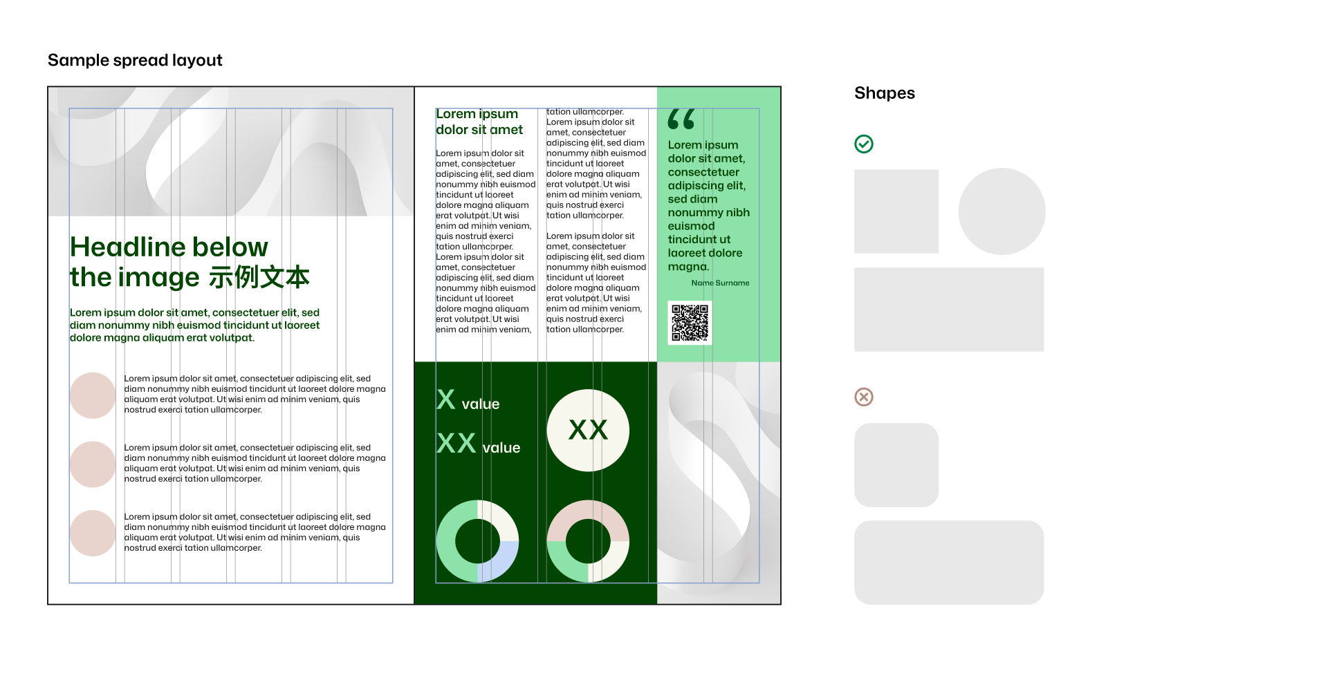
Highlights and shapes

Use geometric shapes in brand colors to emphasize key elements such as icons, numbers, quotes, or important messages. Rectangles, squares, or circles are recommended. Avoid rounded corners, undefined shapes, or blurred edges. Keep designs simple and balanced. Avoid using too many colors in one spread.
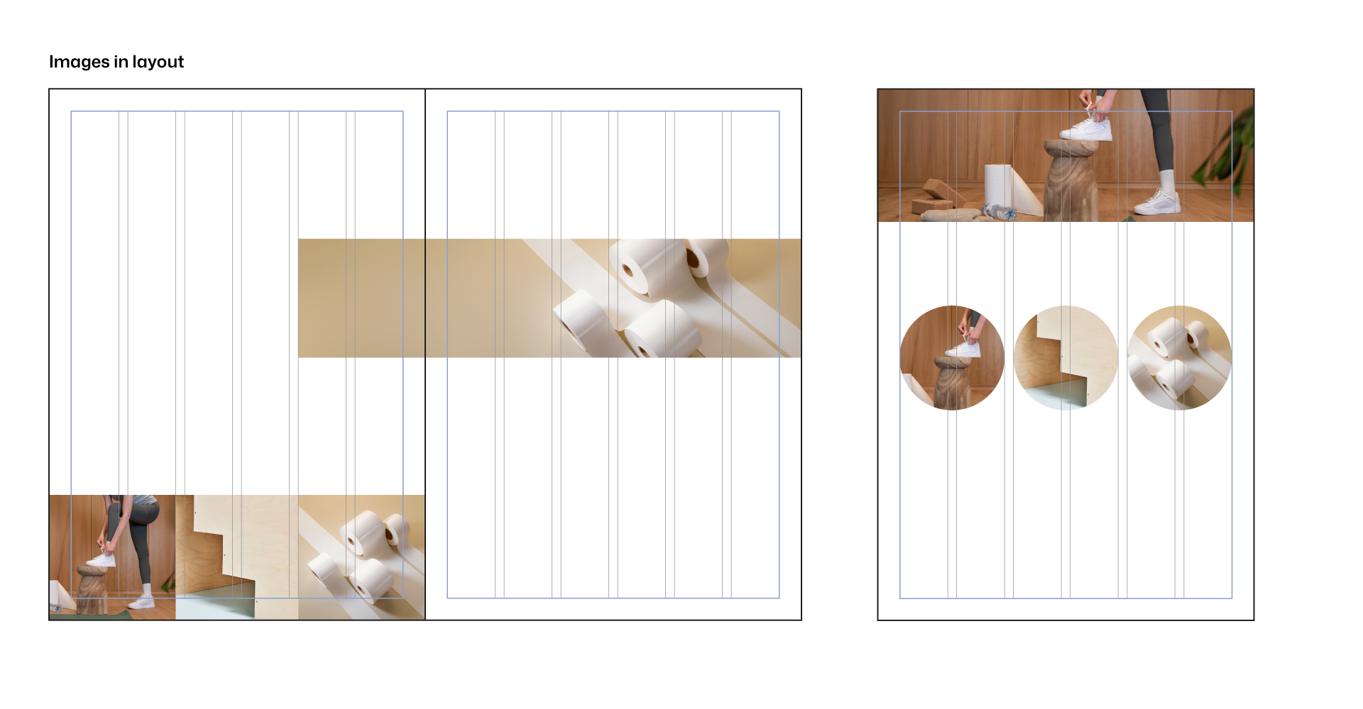
Images in layout

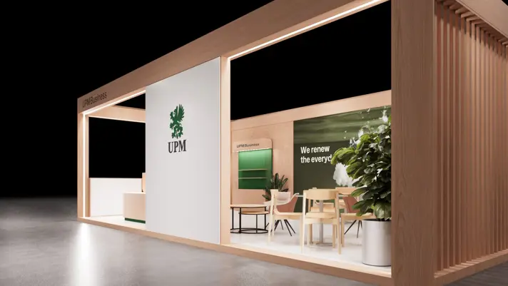
Choose images that reflect the brand tone and quality by following the visual narrative. Images should illustrate content effectively and may serve as decorative elements to reinforce brand alignment.

Ensure images are print-quality, high resolution (300 dpi), and in the correct color mode. Avoid pixelation, distortion, overlays, or off-brand visuals. Crop images only in squares, rectangles, or full circles. Do not apply rounded corners, shadows, blurred edges, or other effects.

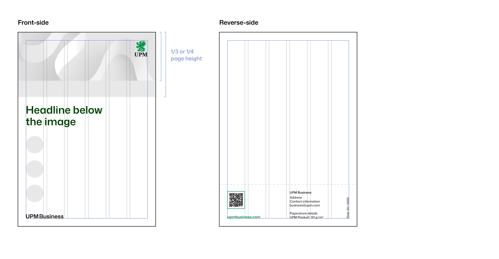
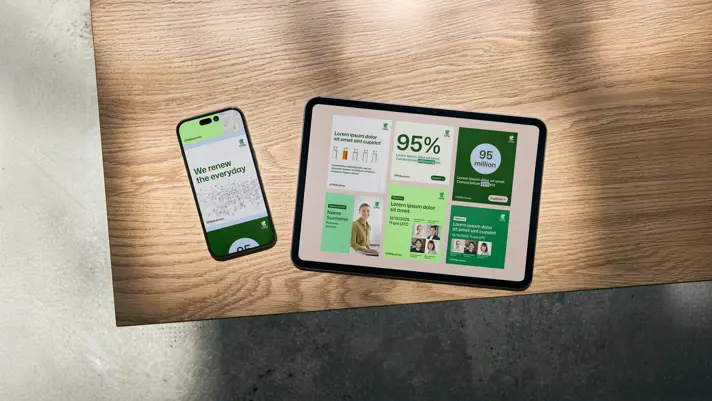
Images can be arranged up to four in a row or column, either vertically or horizontally, with no space between them.

QR code styling 

When placing a QR code in your project, follow these basic rules to ensure clarity, functionality, and brand consistency:

  • Use a standard QR code style with sharp corners, no embedded logos or auto-generated text.
  • To ensure scalability and editability, use a vector format (e.g., SVG, EPS, or PDF).
  • Acceptable colors include solid black (100% K), Reliable green, and white on a dark background or image.
  • Maintain sufficient clear space around the code. Use an outline frame or a white underlay to separate it from the background.  

Always test the QR code by scanning it with your device to confirm readability and correct destination. The minimum printed size is 20 mm on each side. 


Tables styling

Tables used in materials such as brochures and fact sheets can be styled in various ways, but they must follow a few key rules to maintain brand consistency. When incorporating symbols like check marks or dots, use the Mona Sans glyphs instead of custom icons. Always apply brand colors appropriately within tables, following the approved color combinations. Avoid using secondary brand colors for text or symbols. Examples provided below illustrate acceptable table styles using either visible lines or color blocks as dividers. 

Color tints: For limited use, such as highlighting specific columns or rows, brand color tints at 25% or 50% opacity may be used. These tints are permitted only within tables, diagrams, graphs, charts, and illustrations. Please refrain from using tinted colors outside of these specific applications. 


Templates  

To support your creative work, we've provided basic templates for the most common print formats used within the UPM. Feel free to use them as a starting point for designing the printed assets you need.

Note: Selected templates are available in the default A4 and US Letter formats. You can adjust them to your preferred format, while maintaining the logo proportions and grid alignment.


Tips

Before finalizing printed materials, always confirm they are set up for print production.

  • Use CMYK (or Pantone) color mode. Be aware that certain brand colors, like Energy, may appear differently in RGB vs. CMYK. Make sure you’re using the correct color mode for each output, especially when preparing assets for both print and digital.
  • Check that all images are high-resolution (300 dpi) and suitable for print, especially for large formats.
  • Test QR codes by scanning them on a mobile device and confirm they meet minimum size and readability standards.
  • Review text readability: ensure appropriate font size, strong contrast, and clear spacing. Consistent formatting and alignment improve both clarity and brand consistency.